1000!
Last week, Uncharted Area reached one thousand subscribers. We want to thank you all and assure you that we’ll do our best to continue writing engaging content for you.
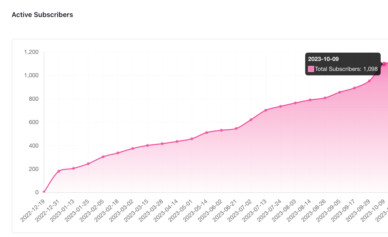
The road to 1000 subscribers!
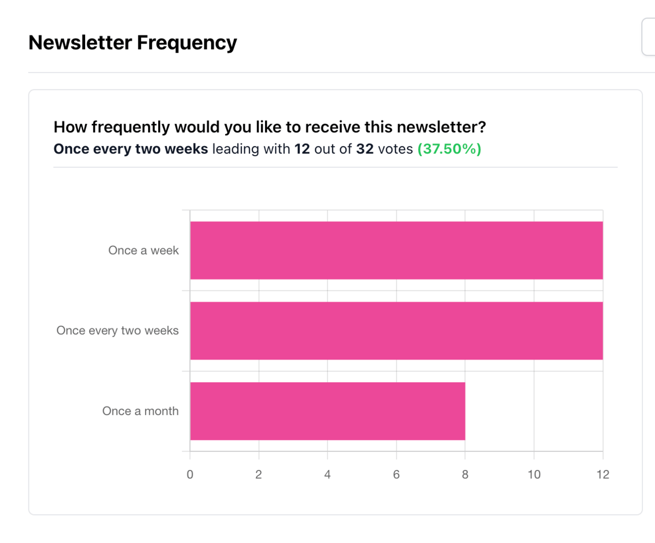
Speaking of writing, we asked you last week at what frequency you would prefer to receive this newsletter, and… it’s a tie!
So, what now?
We have carefully read all your comments regarding the content of this newsletter, and we are glad you are happy with it. We understand that no one likes to receive uninteresting or spammy emails, and we want to ensure that we don't force ourselves to write every week just for the sake of sending an email.
We will not email you if we have no news or good content to share. However, we are committed to finding interesting content and working on new tools, so you can expect to receive an email from us at minimum every two weeks, on Thursday at 4 PM (CEST).
Now for the actual content! This week, we wanted to share how we make our visualizations more fun and personal by adding hand-drawn elements.
Make your visualizations unique
Jessica and I worked on a visualization for the latest London TUG a few weeks ago. The event occurred in a Sherlock-inspired bar, so we wanted our visualization to fit the theme.
Quickly, we had the idea to visualize all Sherlock canons and adaptations using a Beeswarm. We wanted the background to be yellowish to remind us of old books, and we used colors to differentiate the different types of adaptations (books, TV shows, movies, etc).
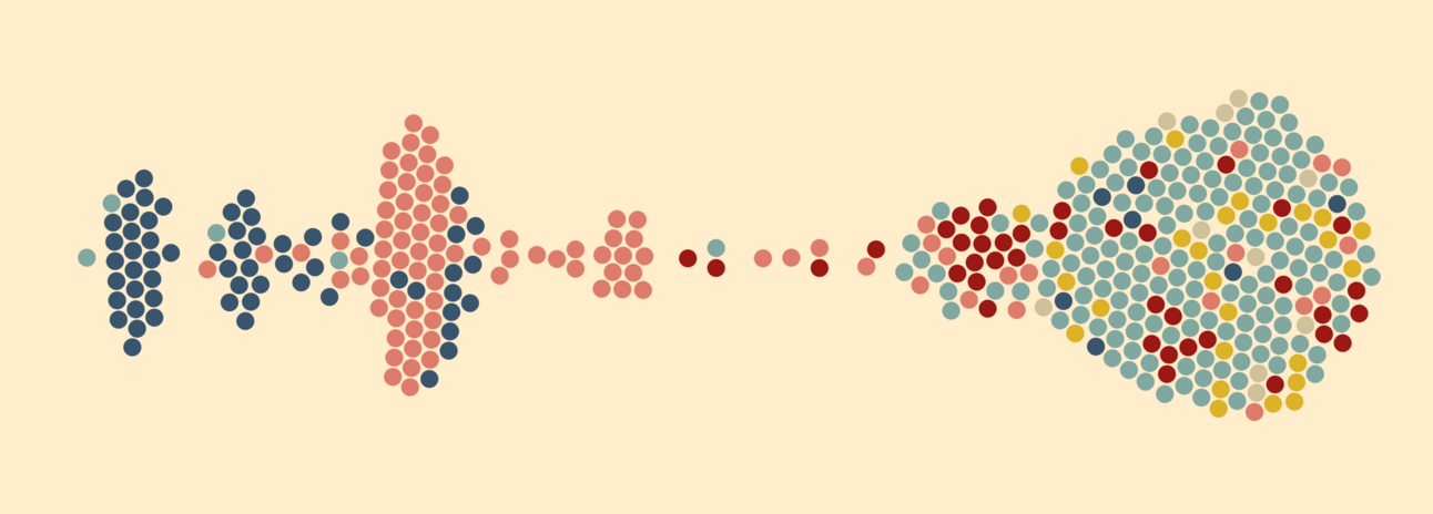
It's a good start, but we can do better!
Although this first result was visually appealing, we felt it was too flat and dull. That is where ProCreate (and Jessica’s drawing skills) can help us make everything better.
ProCreate is a powerful app (only available for iPads and with an Apple Pencil) offering a range of tools for illustrators to create their designs or drawings. If you can’t access ProCreate, you can use any other tool. The main idea is that adding hand-drawn elements to your dashboard will usually make it more personal and intriguing.
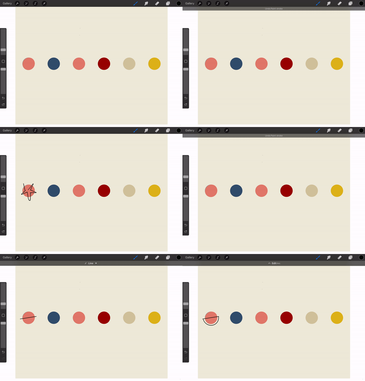
We started by creating a simple legend with our different colors using plain circles and exported it as a new layer in ProCreate.

Then, we looked for some inspiration on the internet. We wanted something visually appealing but not too crowded or complex, as it would make the visualization too heavy for our data.
While searching for “minimalist circles,” we found this image that represented more or less the style we wanted: plain circles with an added feature that made them unique.
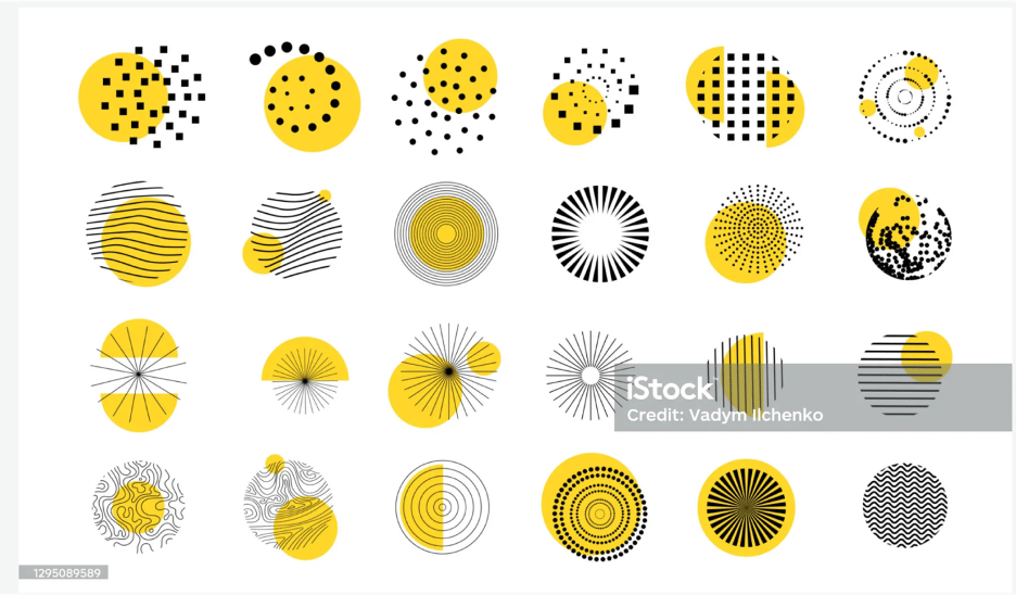
Of course the goal is not to copy or steal the design of the orginal artist. You should aim the get inspired and have a better sense of your different options. Then, when you are ready, you can bring your own style and imagination in the mix.
Jessica started to draw different shapes on top of our existing legend. This is where you can be creative and create different shapes for your circle. You don’t have to be an expert and a good drawer; the objective is to make it unique.
Ultimately, we had several designed layers that included all the circles we liked.
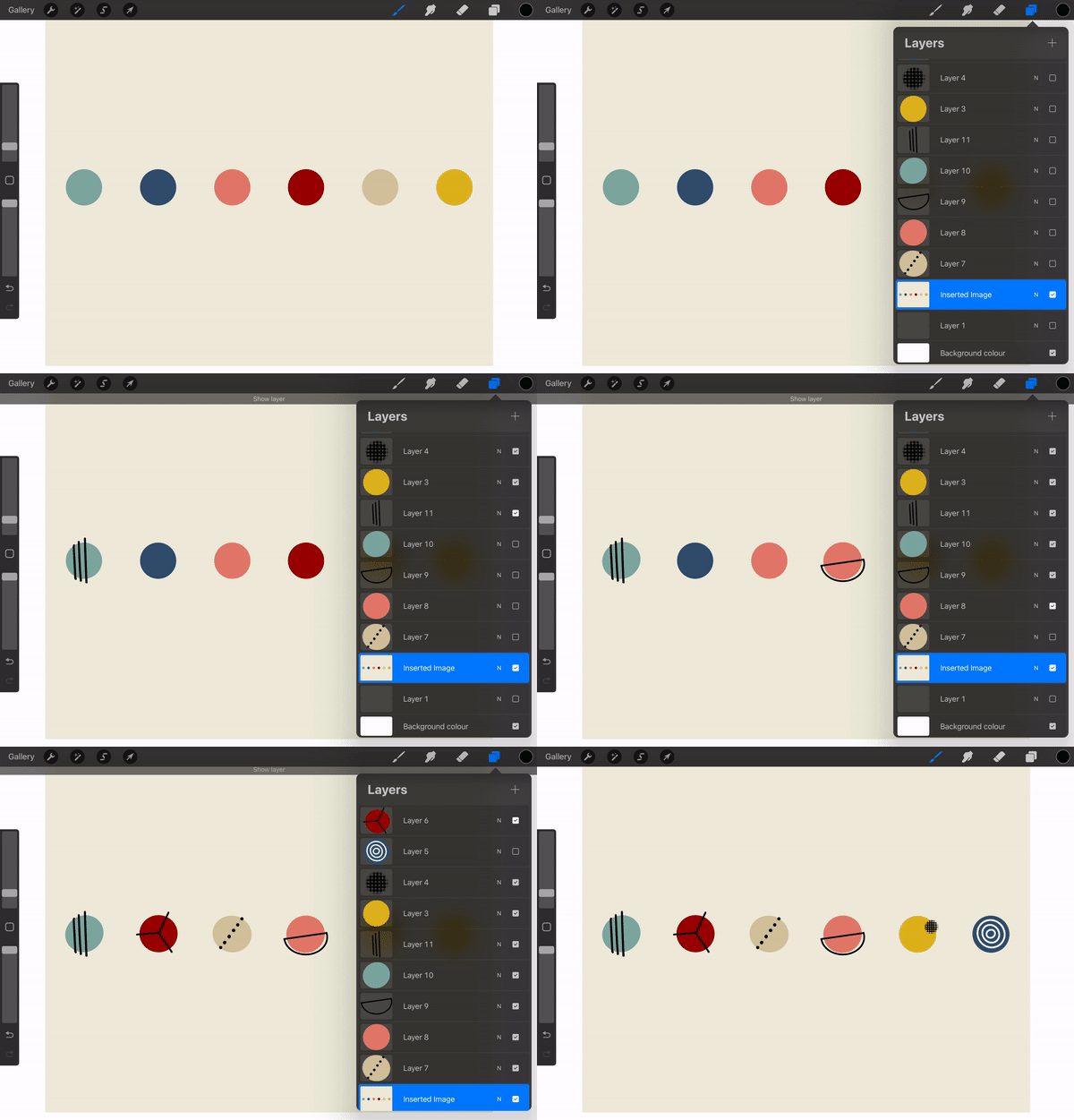
We exported each layer as .png and cropped them into a standardized size. Each icon was then saved in the custom Shapes folder of our Tableau Repository, and they were ready to be used:

This is the final result of our Sherlock Holmes visualization:
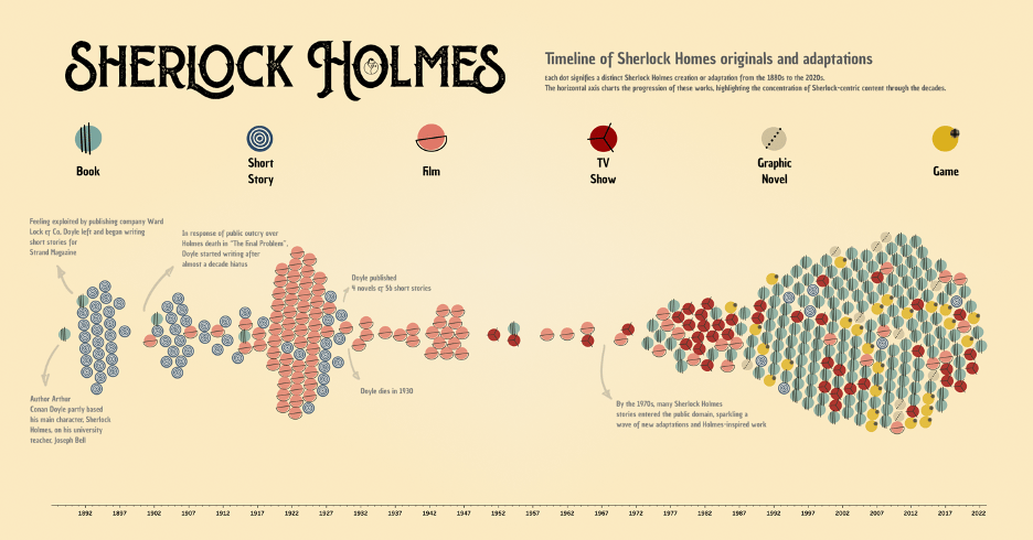
Timeline of Sherlock Holmes's canons and adaptations
We hope you like the result and are inspired to add a bit of your personal touch to your next viz.
We will be back next week with a surprise!
That’s it for this week!
You can reach us easily over there:
‣ Website: https://www.ladataviz.com
‣ Twitter/X : https://twitter.com/ladataviz
‣ Youtube: https://www.youtube.com/@ladataviz
‣ LinkedIn: https://www.linkedin.com/in/ladataviz/
‣ All other links: https://linktr.ee/ladataviz
If you have any suggestions, feedback is appreciated!


